Atlas Cloth
Branding for a filter cloth in Septek Filter’s line of products. Based in industry and the process of mining this identity emphasizes quality, longevity and efficiency in the product.
2024
Brand identity
Client: Septek Filter ab

Process
Background
Septek Filter ab comissioned me to make graphic elements for a new filter cloth in their product line. The cloth in question was given the name atlas cloth by the owner who wanted a logo aswell as a few graphic elements.
Solution
Starting out I turned to nature and the rugged climates of areas where the product is to be used. Combining a clean and ordered typographic approach with rugged imagery of nature the identity aligns with the product’s role both in making mining more effective aswell as championing a more climate concious way of operating.
Elements
Starting with the wordmark the product needed a solid and rugged but clean look that expresses stability aswell as a connection to nature. The slightly rounded corners and jagged lines are meant to emphasize this.
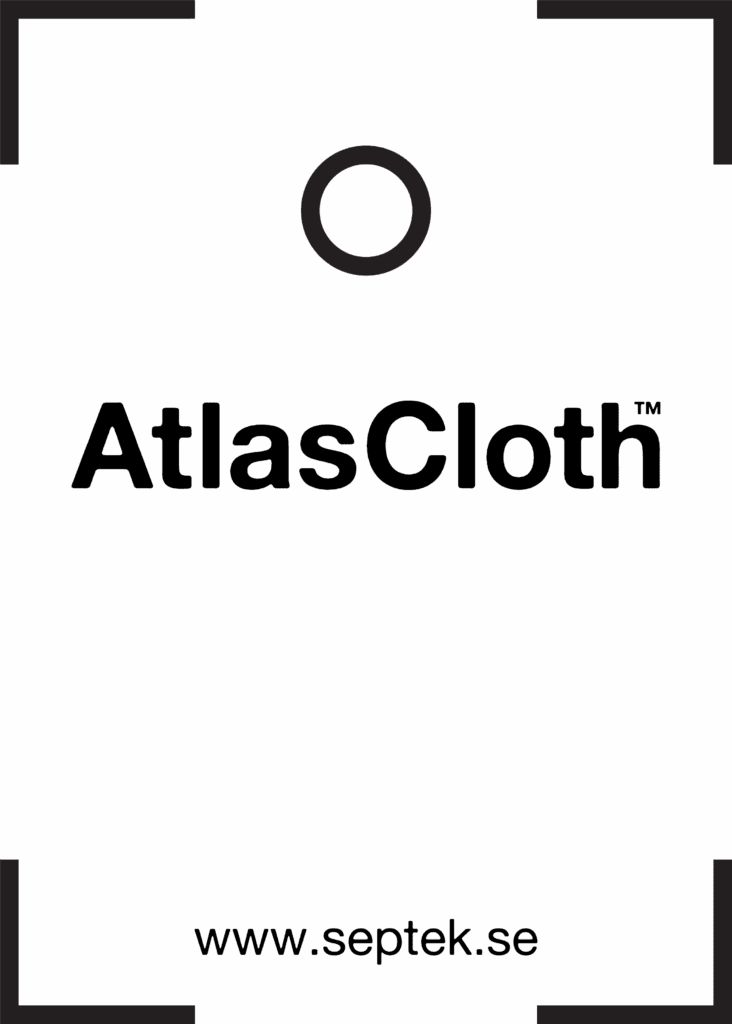
The icon is based on the outline of the product in question. An actual filter cloth has been abstracted down to its corners and central hole. This icon can be used by itself or as part of a lockup. Framing the wordmark with any additional information.
Wordmark

Icon
Lockup

Applications
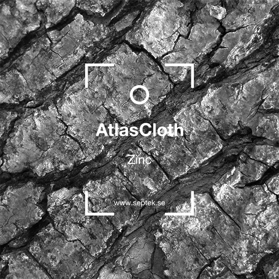
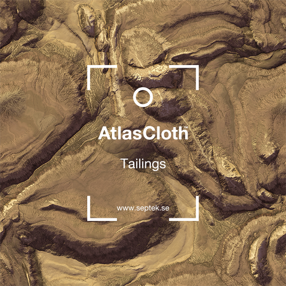
Using the lockup as a base, bespoke images were made to present the different versions of the product meant for different aspects of the mining process. Each image represents a different element with tailings being represented with a more neutral image of sand or dirt.


Additional elements
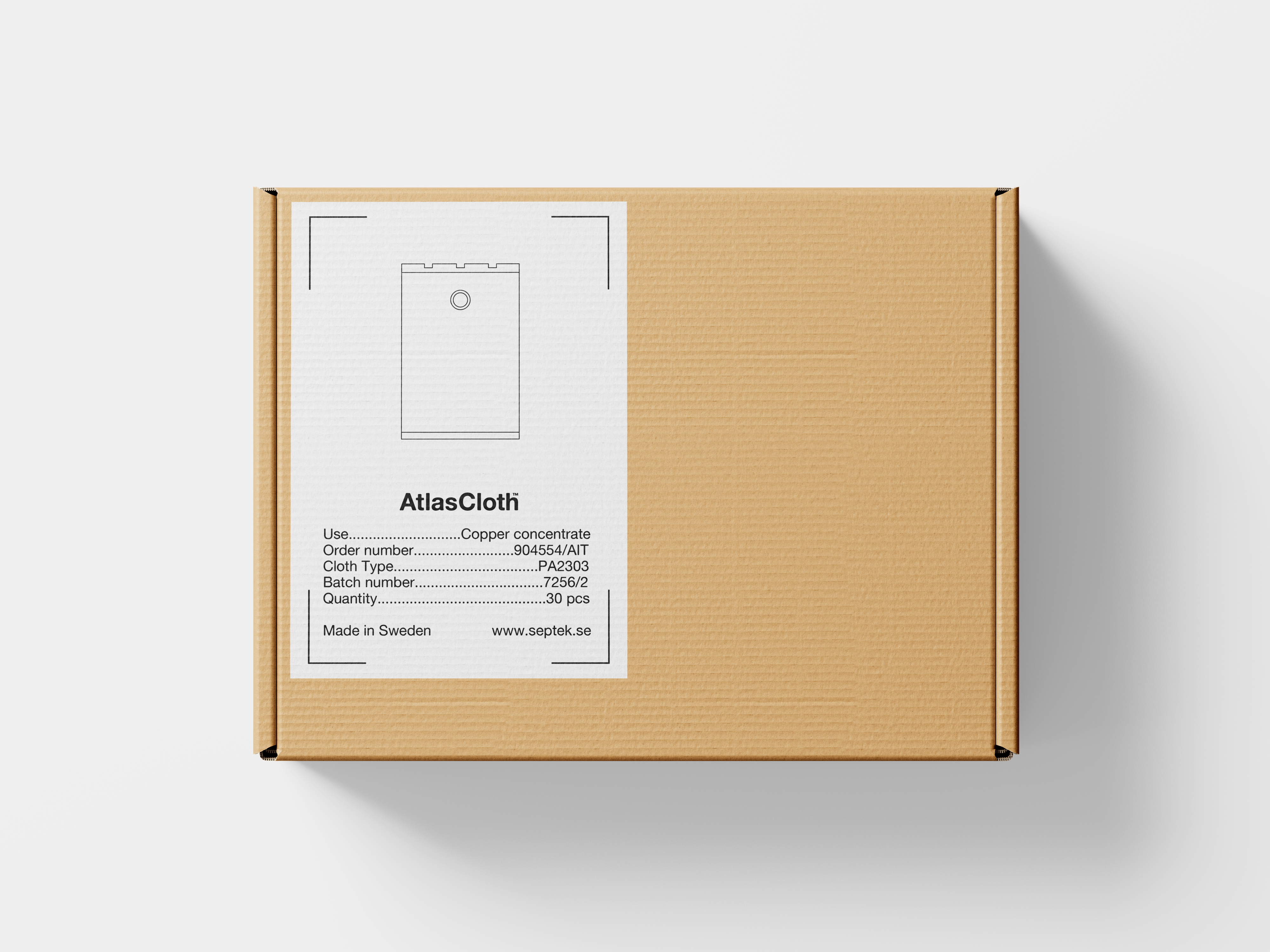
A few additional elements have been created for the first batch of atlas cloth sent to the customer. Here, a lighter version of the frame combined with a more accurate illustration describing the product has been made into a label to be put on the box when sent.